Dashboard Graphs
The Dashboard Graphs are an innovative visual tool that shows you an up-to-date feed of the health of your equipment.
Using the Dashboard Graphs
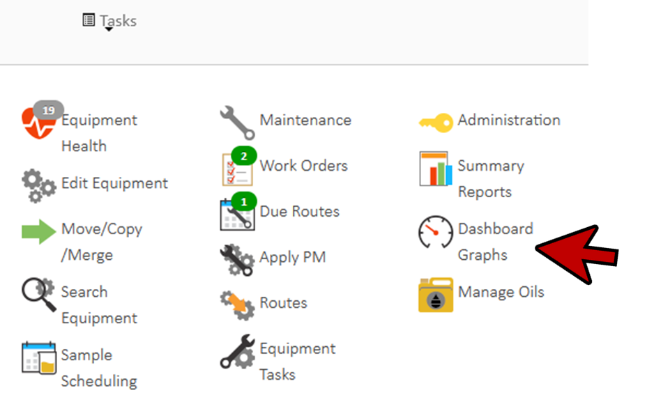
- From the Home page CLICK the Dashboard Graphs icon from the Tasks dropdown to open the Dashboard window. Alternatively, from the left navigation menu, select Account then Dashboard Graphs.
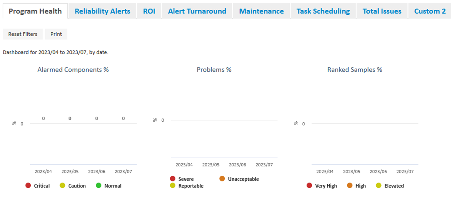
- At the top of the Dashboard window there are six main tabs.
- Program Health – an overview of the Alarmed Components, Problems (Problem Samples), Ranked Samples, Samples, Missing Information, and Turnaround.
- Reliability Alerts – This is a way to track proposed maintenance tasks or actions and even assign responsibility to a myLab User.
- ROI (Return on Investment) – You can assign a cost savings value to any reliability alert that has been created.
- Alert Turnaround – The elapsed time from when a reliability alert has been opened to when it has been responded to / completed / closed in units of days. The bottom 3 graphs are based on an assigned due date that was selected during reliability alert creation.
- Maintenance – This tab is for capturing maintenance compliance. Total number of tasks (maintenance or work orders)
- Task Scheduling – This tab is for monitoring tasks and routes compliance. Related to the Maintenance.
- Let’s review Program Health. Note, the other main tabs will not be reviewed.
- CLICK on the Alarmed Components graph.
- If there is no data showing, select a date range using the bar at the top.
- Moving the date slider will dynamically add or remove available data from the graphs.
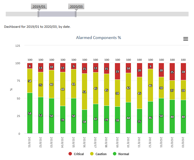
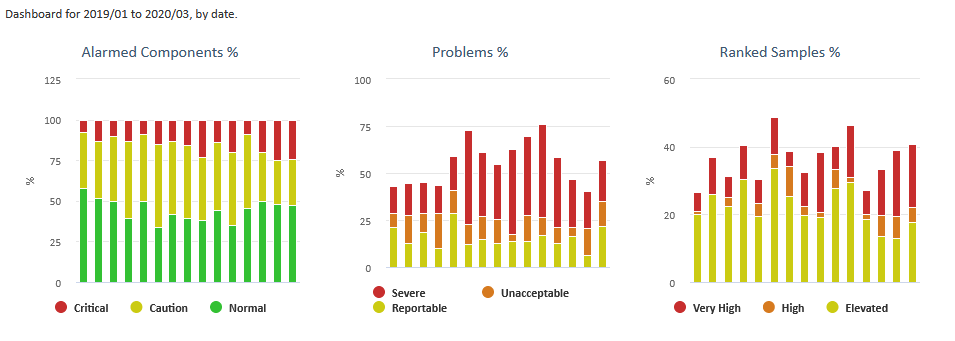
- CLICK the Dashboard Graphs back button to return to the main graphs page. Graphs similar to those below would be shown based on the timeframe selected in the example above.
- Hovering the mouse point over any of the titles will display a brief description of each chart.
- Hovering the mouse pointer of any section of the chart will display the Date Range of the data, Section of Data and the Reported Value.
Creating a Custom Dashboard
- Additional “custom” tabs are available which allow you to choose the graphs you find most valuable to you and your business.
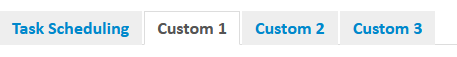
- To create a custom graphs, you would select one of the “Custom” tabs
- CLICK on the top left checkbox. A Graph Selection menu will pop up.
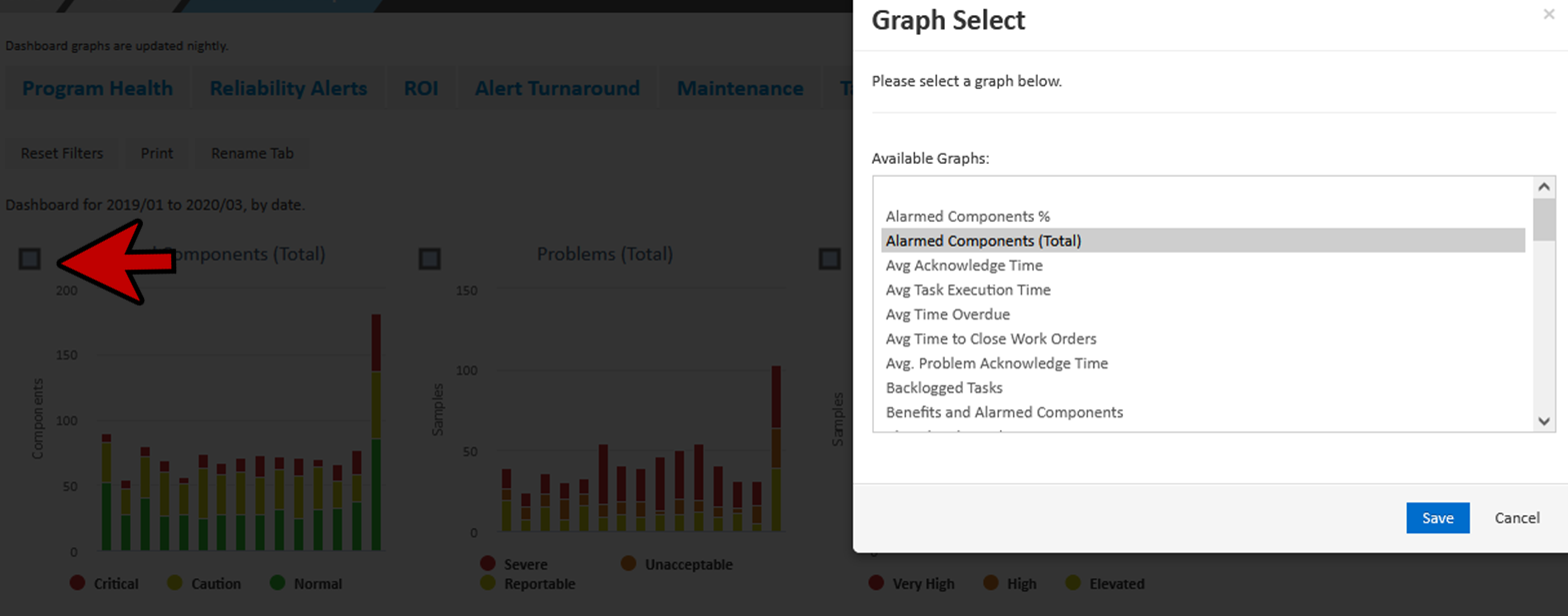
- Select one of the available graphs. For this example, we chose Alarmed Components (Total).
- CLICK Save.
- CLICK on the top middle checkbox. For this example, we selected Problems (Total).
- CLICK Save.
- CLICK on the top right checkbox. For this example, we chose Ranked Samples (Total).
- CLICK Save.
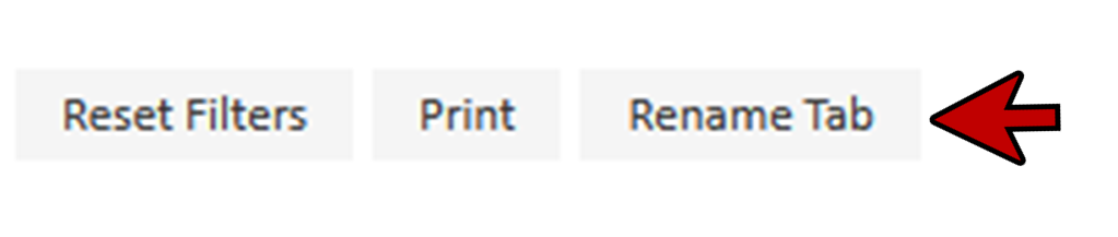
- CLICK Rename Tab.
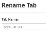
- Enter a new tab name and CLICK Save.
- CLICK Home to return to the Home page.