MyLab Release: May 2025
myLab has been released with a few new homepage and diagnostic features.
Diagnostic Indicators
Three new diagnostic indicators have been added to sample results based on a three states of oil: Contaminants, Oil (Fluid) Condition, and Wear Indicators. These diagnostics have three levels: Good, Caution and Critical.
The new Diagnostics will be featured mainly on the Review New Results and Sample Review pages.
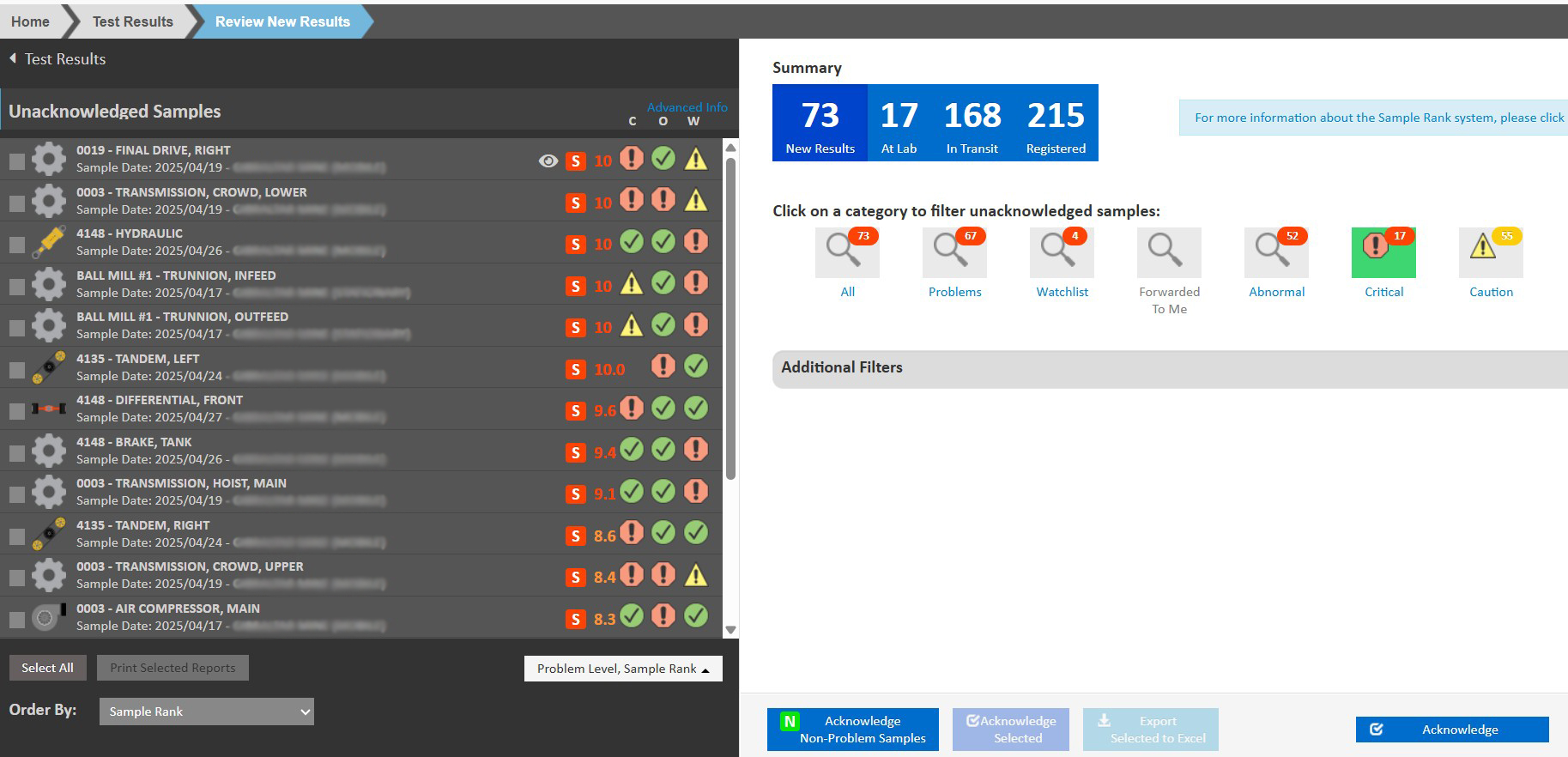
Unacknowledged New Results
Unacknowledged New Results list will display an icon showing the severity of each indicator. If the sample did not have any testing done which applies towards any diagnostic, the space is left blank. The Order By at the bottom of the sample listing has new options to sort by any of these diagnostics, and a new drop down field, below the list on the right, provides the ability to hide the Sample Rank, Problem Level, or the Diagnostics from the sample list. New quick filter options on the right side of the screen can be used to show only certain severity levels for each new diagnostic – the “Caution” and “Critical” filters will display only samples with those severities.
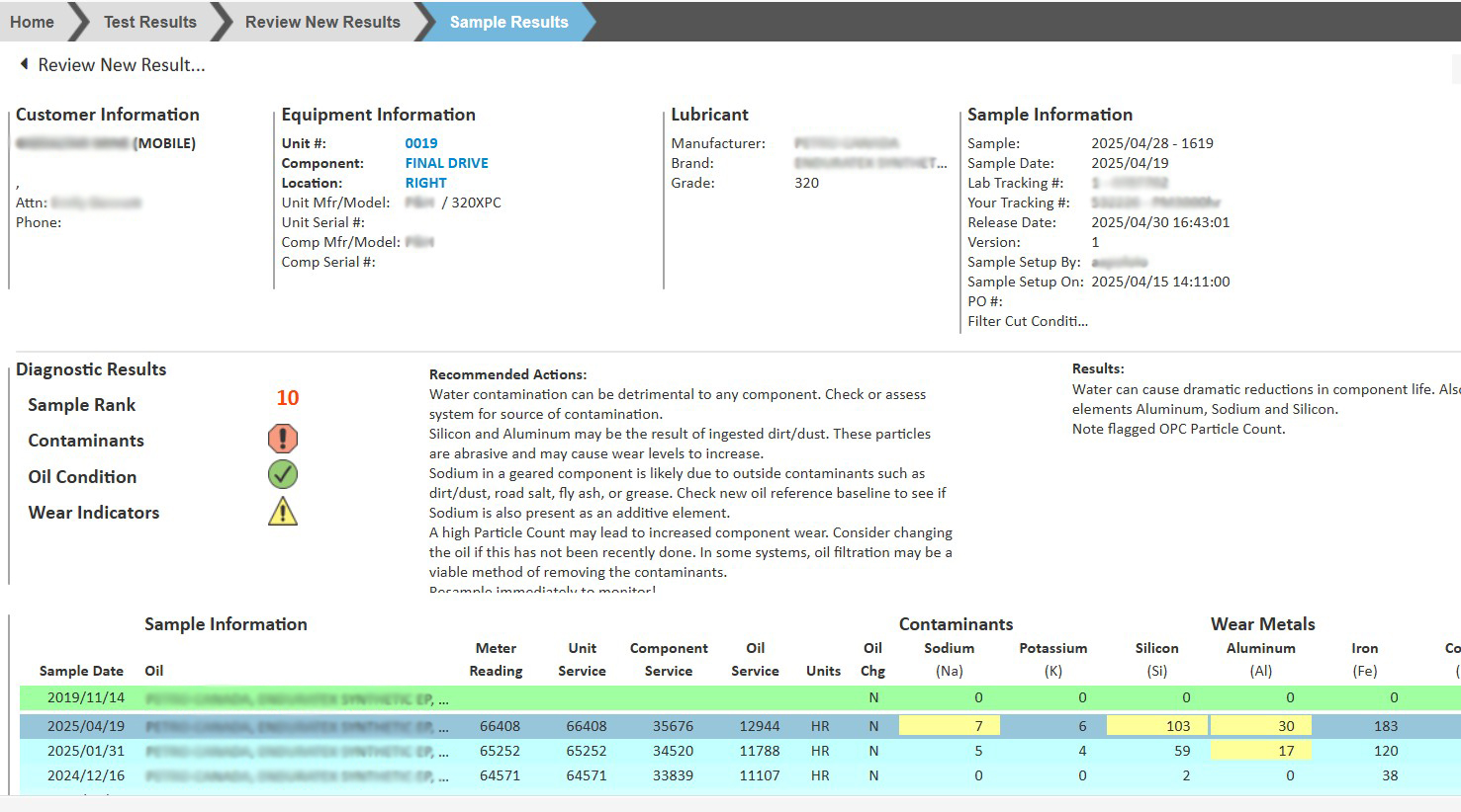
Sample Review
On the Sample Review page, we have removed the page-wide Sample Rank bar and replaced it with a more useful sample summary. The left side indicates the Sample Rank and the Severity Level of each Diagnostic, while the Results and Recommendations for the selected samples display on the left. The Severity Level allows you to zero in on the the diagnostic – Contamination, Condition or Wear – that’s most critical to your equipment.
Homepage Charts
We’ve added a new set of charts to the myLab homepage. Currently there are three charts: In Service Units Sampled, Ranked Samples, and Transit Time. The time period currently defaults to 30 days but can be changed in each User’s preferences. These charts can be hidden or displayed by clicking the arrow to the right of the chart section.
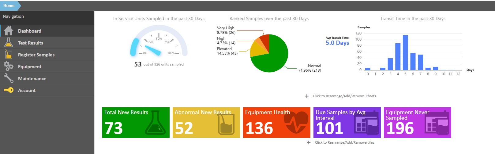
The In-service Units Sampled Over the past X days chart shows the percentage of units sampled over the time period indicated and can highlight if there’s an issue with compliance or the equipment database (units in service). Clicking on the chart takes you to a new Equipment Overview page where you can view all your units and components’ latest health.
The Ranked Samples over the past X days chart shows the percentage of samples that are normal compared to those with issues. Clicking on this graph will take you to the Dashboard Graphs page where you can adjust the view to monitor trends.
The Transit Time in the past X days chart shows the average transit time (time from sample registration to arrival/set up in lab) and the distribution of samples based on number of transit days. Clicking on this chart takes you to the Dashboard Graphs page where you can review turnaround in more detail.
Homepage Tiles
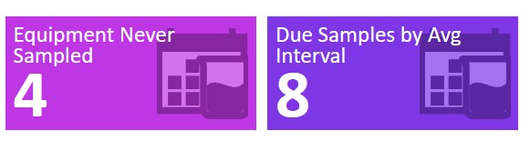
There are two new KPI tiles: Equipment Never Sampled and Due Samples by Average Interval. These tiles show the associated counts and link to the Due Samples page where there are 2 new tabs.
Equipment Never Sampled is lists any equipment/components that have not yet been sampled. From this list, you can determine if any equipment should be marked as not in service. Due Samples by Average Interval lists components that are not on a schedule but are expected to be sampled based on prior sampling activity.